Cartography, the science and art of creating maps, has long relied on visual perception as a core element of effective map design. But what exactly does visual perception mean in the context of cartography, and why is it so crucial?
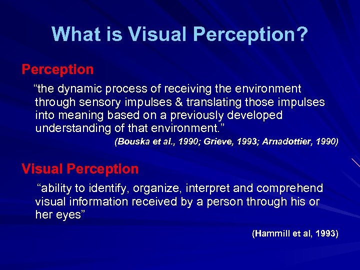
Visual perception refers to the process by which the brain interprets and makes sense of visual stimuli. When applied to cartography, it describes how people interpret the various elements of a map—such as colors, symbols, shapes, and spatial arrangements—to understand the geographical information presented. Whether you’re a casual map reader or a seasoned geographer, visual perception determines how easily you can comprehend a map’s message.
In cartography, visual perception affects everything from how viewers focus their attention on different parts of the map to how they interpret relationships between various map elements. A well-designed map must align with the principles of human visual perception, ensuring that its content is clear, engaging, and informative for all types of users.

The Basics of Visual Perception
Visual perception is a complex process, involving the brain’s ability to interpret and organize visual data from the environment. In the context of cartography, understanding the basic principles of visual perception helps cartographers create maps that are easy to understand and visually appealing.
The key components of visual perception include:
- Shape: How the brain identifies and categorizes different forms, such as lines, points, and polygons on a map.
- Color: How color affects the differentiation of various map elements, helping users interpret information more quickly.
- Size: The perception of size differences to indicate importance or scale on maps (e.g., larger symbols representing major cities).
- Depth: Perceiving three-dimensional relationships on two-dimensional maps, often achieved through shading or perspective.
- Spatial Relationships: The brain’s ability to comprehend the relative positioning of objects, which is crucial for understanding map layouts and geographic data.
When we look at a map, our brain doesn’t just passively absorb information. Instead, it actively processes visual cues to construct an understanding of the geography being represented. This process involves recognizing patterns, identifying important elements, and making decisions about the spatial relationships between features.
For example, when viewing a weather map, visual perception allows us to understand that regions with darker shades of blue represent colder temperatures, while those with bright orange or red represent warmer conditions. This color contrast, aligned with natural human tendencies in interpreting colors, helps users quickly grasp the information at a glance.
Visual perception is the cognitive foundation that allows users to engage with and interpret maps. Without considering these perceptual elements, a map may become too cluttered, confusing, or misleading. Next, we will explore how these basic principles of visual perception are applied in cartographic design.

Visual Perception in Cartography
Visual perception plays a pivotal role in cartography, shaping not only the design but also how maps are interpreted. When creating a map, cartographers must consider how the human brain processes visual information, ensuring that the layout, symbols, and colors are easy to understand and interpret.
Visual hierarchy is one of the most important concepts in cartography. It refers to the arrangement of visual elements in a way that guides the viewer’s attention to the most important parts of the map first. For example, larger symbols or brighter colors may be used to represent significant locations or features, while less important data might be represented with subtler shades or smaller symbols.
An effective visual hierarchy can make a map much easier to read by ensuring that the viewer knows where to look first and what to focus on. Key techniques used in cartographic design to enhance visual perception include:
- Symbolism: Using standardized symbols (e.g., stars for capital cities, dots for towns) allows viewers to immediately recognize what they represent without needing to consult a legend.
- Color differentiation: Maps often use contrasting colors to represent different categories of data. For instance, political maps use distinct colors to represent different countries or regions, while environmental maps may use greens and browns to show forest cover and land use.
- Spacing and alignment: Proper spacing between elements on a map prevents clutter and allows the eye to differentiate between separate entities.
In a well-designed map, the viewer should be able to understand the main message within just a few seconds. This instant comprehension is the result of cartographers applying visual perception principles, making sure that the map is intuitive, structured, and visually appealing.
Case Study: Visual Perception in Modern Interactive Maps
With the rise of interactive digital maps, such as those seen on GIS platforms or mapping applications, visual perception has become even more important. Interactive maps allow users to zoom, click, and customize layers, making it essential for the map to be readable at all zoom levels and under different data conditions.
For example, in a city zoning map, visual perception principles such as color coding for residential, commercial, and industrial zones can help users distinguish between different land uses. If colors are too similar or symbols are overcrowded, the map loses its clarity and the user might struggle to find the information they need.
Visual perception in cartography is all about creating a seamless interaction between the map and its reader. By applying the principles of visual hierarchy, symbolism, and proper spacing, cartographers ensure that their maps communicate complex data in a clear and engaging way.

Elements of Visual Perception in Map Design
The success of any map lies in its ability to clearly convey information through effective design elements that leverage human visual perception. In cartography, several core elements—such as color, shape, size, and depth—are utilized to make maps easy to interpret and visually appealing. Let’s break down these elements in detail.
Color in Cartography
Color is one of the most powerful tools in cartographic design because of its strong influence on how users perceive information. Different colors can evoke distinct responses, so selecting the right color scheme is essential for clear communication.
- Color Perception and Meaning:
- Warm colors like red, orange, and yellow are often used to depict higher intensities (e.g., temperature, population density).
- Cool colors like blue and green tend to represent calmness or lower intensities (e.g., water bodies, vegetation).
- Color Contrast:
- High contrast between colors can help distinguish between different data sets on a map, making it easier for users to recognize patterns and important regions.
- For example, a population density map might use dark red for densely populated areas and light yellow for sparsely populated areas, ensuring the viewer immediately grasps the distribution.
- Accessibility Considerations:
- It is essential to design maps that are accessible to all users, including those with color blindness. Using patterns, shades of gray, or varying lightness can help ensure maps remain readable for these individuals.
Shape and Symbols
Shapes and symbols on a map provide immediate recognition of specific features. For instance, common symbols like stars for capitals or circles for cities are universally understood.
- Recognizing Shapes:
- Simple, clear shapes are easier for the brain to process. For example, triangles, squares, and circles are often used to differentiate between types of landmarks (e.g., mountains, towns, airports).
- Overly complex shapes or icons can confuse the reader, detracting from the map’s purpose.
- Symbol Standardization:
- Cartographers often rely on internationally recognized symbols for common map elements, making it easier for readers from different regions to interpret the map.
- For example, blue lines typically represent rivers, and green areas symbolize forests or parks.
Size and Scale
Size plays a key role in representing significance or magnitude on a map. Larger features naturally draw more attention and are perceived as more important.
- Size to Represent Importance:
- In city maps, larger circles might be used to indicate bigger cities, while smaller circles mark less significant towns or settlements.
- In disaster mapping, larger symbols may highlight areas with higher risk or greater impact.
- Scaling:
- Maps are often scaled to represent large geographical areas on a manageable medium. Understanding the concept of scale helps users interpret distances and area sizes correctly.
- Bar scales and ratio scales (e.g., 1:50,000) ensure that users can estimate real-world distances accurately from the map.
Depth and Layers
Although maps are two-dimensional representations, adding depth can create the illusion of three-dimensionality, enhancing the map’s realism and readability.
- Shading and 3D Representation:
- Shading techniques are often used to depict terrain elevation or contours. For instance, hills and valleys can be represented by varying shades of the same color, allowing the user to perceive depth.
- Layering Information:
- In GIS-based maps, multiple layers of information (e.g., population data, transport routes, and land use) are combined to give a detailed, multidimensional view of a region.
- Layered maps allow users to focus on specific aspects of the data by turning certain layers on or off, which enhances their overall perception of the map.
Effective map design depends heavily on a cartographer’s ability to use color, shape, size, and depth in a way that aligns with the principles of visual perception. When these elements are applied thoughtfully, they allow viewers to interpret maps quickly and accurately, making complex geographical information more accessible to all users.