Cartography is an ancient practice, but it remains as relevant today as ever. As the art and science of map-making, cartography has evolved through centuries, guiding explorers, governments, and individuals. From early hand-drawn maps to modern digital renditions powered by advanced technology, cartography plays a crucial role in how we navigate and understand our world.
The Fundamental Principles of Cartography
Creating a map is more than just plotting points on a paper or screen. There are specific rules of cartography that must be followed to ensure the map serves its intended purpose and is readable, accurate, and useful.
Purpose and Audience of a Map
Every map begins with a question: Why am I making this map? This is the guiding principle behind any cartographic effort. The purpose of the map will dictate its design, content, and level of detail. For instance, a navigation map for sailors requires precise coastline and depth data, while a thematic map illustrating population density might prioritize social data over geographical accuracy.
Equally important is considering who will use the map. For example, a political map intended for students must be clear and simple, while a map for engineers working on an urban development project may require detailed infrastructure data. Understanding the audience ensures that the map communicates effectively, meeting the users’ specific needs.
Key considerations:
- What is the map’s purpose? (navigation, exploration, education)
- Who is the intended audience? (general public, professionals, scholars)
- What level of detail is required? (basic features or complex details)
Accuracy vs. Aesthetic Appeal
Cartography is both an art and a science, which means maps must balance accuracy and aesthetic appeal. Accurate representation is crucial for users relying on the map for navigation, data analysis, or decision-making. However, if the map is too cluttered or difficult to read, it loses its utility.
This balance can be tricky. Simplification is often necessary to make a map readable. For instance, a map of an entire country might omit minor roads and small towns, focusing instead on major highways and cities. However, this should not come at the cost of distorting critical information.
Modern cartographers use various techniques, such as:
- Symbolization: Using icons to represent features (e.g., a blue line for rivers, triangles for mountains).
- Color Coding: Assigning colors to areas like forests, water bodies, or political regions.
- Text Labels: Adding names of cities, rivers, and landmarks in a way that doesn’t overcrowd the map.
In practice, many maps prioritize readability over strict geographic precision, depending on their purpose. For example, subway maps are notoriously inaccurate in terms of distance and direction, yet they are designed to be easily navigable for commuters.
Examples of balancing accuracy and aesthetics:
- Subway maps (e.g., the London Tube map) use stylized lines to simplify complex routes.
- Topographic maps balance terrain accuracy with clear symbols for mountains, rivers, and roads.
Scale in Cartography
Scale is one of the most fundamental aspects of map-making. It refers to the relationship between a distance on the map and the corresponding distance on the ground. For example, a 1:100,000 scale means that one unit on the map (say, one inch) equals 100,000 units in real life.
Different scales serve different purposes:
- Large-scale maps (e.g., 1:10,000) show small areas in great detail, such as street maps or building plans.
- Small-scale maps (e.g., 1:1,000,000) show large areas, like countries or continents, but with less detail.
Choosing the right scale is essential for a map’s accuracy and usability. A world map, for instance, does not need to show every small village, while a neighborhood map must include minute details like road names and parks.
Key types of scale representation:
- Representative Fraction (RF): Expressed as a ratio (e.g., 1:50,000).
- Verbal Scale: A written statement (e.g., “One inch equals one mile”).
- Graphic Scale: A bar or line divided into segments representing real-world distances.
Incorporating the correct scale ensures that a map serves its purpose—whether it’s for an adventurer plotting their route through a mountain range or a tourist navigating a new city.

Geographic Coordinates and Projections
Understanding geographic coordinates and map projections is critical in cartography. These elements enable accurate representation of the Earth’s surface on a flat map, despite its three-dimensional nature. Without coordinates and projections, maps would lose their ability to pinpoint locations or maintain scale and direction accurately.
Latitude and Longitude
The Earth is divided into a grid using latitude and longitude, forming the basis for geographic coordinates. These coordinates are essential for identifying any location on the planet, and they serve as the backbone for accurate map-making.
- Latitude refers to the horizontal lines that run parallel to the equator. These lines measure the distance north or south from the equator (0°), ranging from 0° at the equator to 90° at the poles.
- Longitude refers to the vertical lines running from the North Pole to the South Pole. These lines measure the distance east or west from the Prime Meridian (0°), which runs through Greenwich, England.
Every location on Earth is defined by a pair of latitude and longitude coordinates. For example, New York City’s approximate coordinates are 40.7128° N, 74.0060° W.
Key points to remember:
- Latitude is measured north-south, while longitude is measured east-west.
- Latitude lines are parallel, but longitude lines converge at the poles.
- Together, they provide a precise method of locating any point on Earth.
This coordinate system is foundational in cartography, allowing for consistent global navigation and mapping, regardless of the scale or type of map being used.
Map Projections and Distortions
The Earth’s spherical shape presents a significant challenge for map-makers: how do you represent a round object on a flat surface without distorting it? The answer lies in map projections, but every projection comes with some degree of distortion—whether it’s in shape, area, distance, or direction.
There are several common map projections, each designed with different priorities in mind.
- Mercator Projection:
- One of the most well-known projections, the Mercator projection preserves direction, making it useful for navigation. However, it significantly distorts area, especially near the poles, causing regions like Greenland to appear much larger than they actually are.
- Robinson Projection:
- The Robinson projection is a compromise between preserving shape and area. It minimizes distortion but doesn’t eliminate it entirely. This projection is often used for world maps in atlases and educational materials because it provides a more balanced view of the world.
- Winkel Tripel Projection:
- This projection is commonly used by the National Geographic Society because it strikes a balance between minimizing distortions of area, shape, and distance. The Winkel Tripel is particularly effective for displaying the entire world.
Each projection serves a different purpose, and cartographers choose the appropriate one depending on the map’s objective. For example, nautical maps typically use the Mercator projection for accurate direction, while world maps intended for general viewing often use the Robinson or Winkel Tripel projections to balance distortions.
Comparison of Projections
| Projection Type | Purpose | Distortion | Best Use |
|---|---|---|---|
| Mercator | Preserves direction for navigation | Distorts area near the poles | Sea navigation |
| Robinson | Compromise between shape and area | Slight distortions in both shape and area | World maps for education |
| Winkel Tripel | Minimizes all forms of distortion | Some minor distortions in shape and distance | General world maps |
Why do distortions happen?
- When projecting a 3D sphere onto a flat surface, it’s impossible to maintain accurate shape, area, distance, and direction all at the same time.
- Depending on the projection chosen, one or more of these elements will be distorted, which is why no single map projection is perfect for all uses.
Understanding the strengths and weaknesses of different projections helps map users and cartographers choose the right tool for the job.
Choosing the Right Projection
The choice of a projection depends heavily on the purpose of the map. A map meant for airline navigation would prioritize accurate distances and directions, while a map used in a classroom might prioritize a visually balanced representation of the world’s countries.
Cartographers often ask the following questions when selecting a projection:
- What is the map’s primary function?
- Which geographic areas are being represented?
- Is direction, area, or distance most important for the map’s users?
Choosing the right projection ensures that the map communicates its information effectively, minimizing confusion and maximizing accuracy in the intended context.

Cartographic Symbols and Conventions
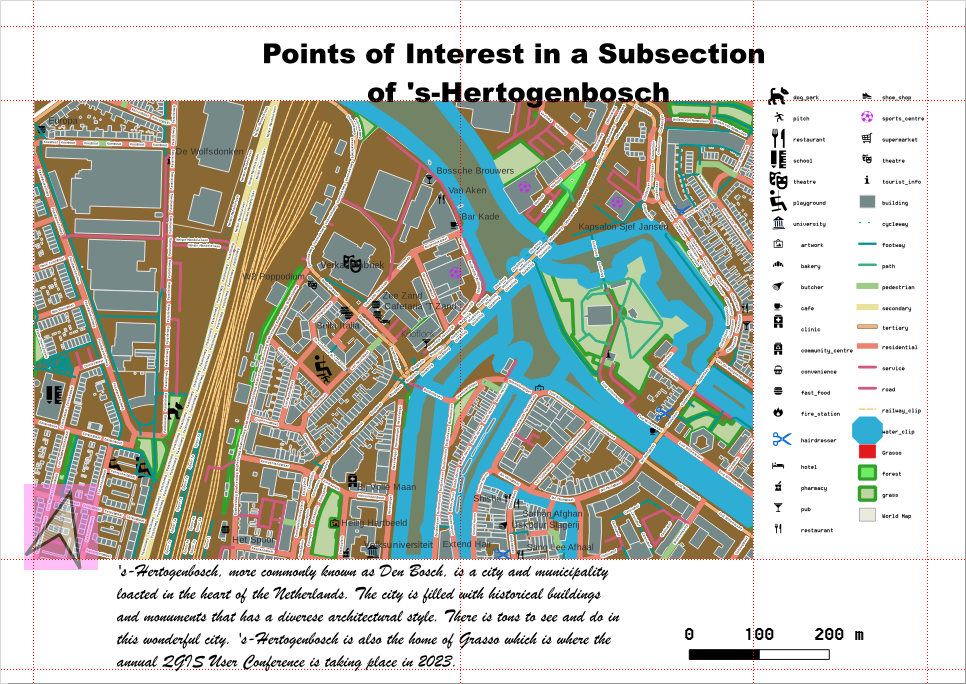
One of the key rules of cartography is the effective use of symbols and conventions to convey information in a way that is easy to understand. Without symbols, maps would be cluttered with overwhelming details, making them unreadable. Cartographers use a wide array of symbols, colors, and lines to represent different features, allowing users to quickly identify important information.
The Role of Symbols in Cartography
Cartographic symbols are essential tools that allow complex information to be represented clearly and concisely. A well-designed map uses symbols to replace text-heavy descriptions, making the map both informative and easy to read. These symbols are universally understood and follow standardized rules, making them applicable across different languages and cultures.
Common symbols on maps include:
- Dots for cities and towns.
- Lines for roads, rivers, or political boundaries.
- Triangles or peaks for mountains.
- Stars for capital cities.
Why symbols matter:
- Symbols reduce clutter and make the map cleaner and more understandable.
- They help standardize maps so they can be easily interpreted by anyone, anywhere in the world.
- By using universally recognized symbols, cartographers ensure that maps are functional for different audiences and purposes.
For example, transportation maps use different types of lines to represent various modes of transport. Solid lines might represent highways, while dashed lines could indicate walking paths. Such distinctions help users interpret the map quickly and navigate accordingly.
Colors and Shading in Cartography
Color plays a crucial role in cartography. It is not only used to make maps visually appealing but also to differentiate between types of features, indicate elevation, or represent thematic data (like climate zones or political regions). Proper color usage follows a standard approach to ensure consistency across different maps.
Here are some common uses of colors in cartography:
- Blue typically represents water bodies such as oceans, rivers, and lakes.
- Green is used for lowland areas, forests, or fertile lands.
- Brown often signifies higher elevations like mountains.
- Yellow or beige can represent deserts or dry areas.
- Red may be used to highlight roads, borders, or important landmarks.
Additionally, shading and contouring techniques are used to represent terrain and elevation. Contour lines, for instance, connect points of equal elevation, helping to show the shape of the land. Areas with closely spaced contour lines represent steep terrain, while widely spaced lines suggest flatter areas.
In thematic maps, where data like population density or climate patterns are represented, colors are often used to signify different categories. For example, a map of population density might use darker shades for highly populated regions and lighter shades for less populated areas.
Line Types and Their Meanings
Lines are another important convention in cartography, helping to convey various types of boundaries, paths, and geographic features. Different types of lines are used to show a range of data, such as:
- Solid lines: Used to represent clear, definitive features like highways or political boundaries.
- Dashed lines: Often used to indicate less permanent or undefined boundaries, such as disputed borders or footpaths.
- Thick lines: Can denote major roads or larger geographic features like rivers.
- Thin lines: Typically used for minor roads, paths, or small streams.
These line variations ensure that maps can show complex networks—such as road systems or political boundaries—without overwhelming the user with too much detail. The consistent use of line types helps users immediately understand the significance of each boundary or feature.
For example, on a political map, thick solid lines might indicate national borders, while thinner dashed lines could represent internal administrative boundaries, such as state or province divisions. This layering of information allows maps to be both detailed and easy to interpret.
Quick Reference for Line Types:
- Solid line: Fixed boundaries (national borders, major roads).
- Dashed line: Temporary or disputed boundaries, minor roads.
- Thick line: Main roads, rivers, or key features.
- Thin line: Minor features, paths, or less significant boundaries.
Together, symbols, colors, and line types work to create a readable and functional map that can communicate a large amount of information without overwhelming the viewer. These conventions ensure consistency in map-making, allowing users to read and interpret maps accurately, no matter where they are in the world.

Data Collection and Sources for Maps
At the heart of any accurate map is data. Cartographers rely on a variety of data collection methods and sources to ensure their maps reflect the most accurate and up-to-date information. This process involves gathering raw data from different sources, verifying its accuracy, and then translating it into a visual format that can be used for navigation, planning, or analysis.
Geographic Data Sources
Historically, cartographers collected data through ground surveys, but modern technology has vastly improved the accuracy and ease of data collection. Today, geographic data comes from a variety of high-tech sources, each offering unique advantages.
- Traditional Surveys:
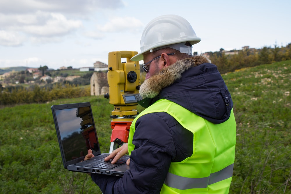
- Traditional land surveying involves measuring distances, angles, and elevations on the ground using tools like theodolites and GPS receivers. While these methods are highly accurate, they can be time-consuming and labor-intensive, especially in large or difficult-to-access areas.
- Aerial Photography:
- One of the biggest advancements in cartography was the introduction of aerial photography. By taking photos of the Earth’s surface from airplanes or helicopters, cartographers can gather detailed information about land use, terrain, and infrastructure. Aerial photography is still used today, particularly in the creation of topographic maps.
- Satellite Imagery:
- Satellites now provide cartographers with near-real-time data that can cover vast areas of the Earth’s surface. This method is particularly useful for tracking changes over time, such as urban development, deforestation, or the effects of natural disasters.
- Tools like Google Earth and NASA’s Landsat program use satellite imagery to provide high-resolution, up-to-date maps of the world.
- LiDAR (Light Detection and Ranging):
- LiDAR technology uses laser beams to measure distances by bouncing light off surfaces. This technology can generate highly detailed 3D maps of terrain, making it invaluable for mapping forests, coastal zones, and urban environments.
- GIS (Geographic Information Systems):
- GIS is a powerful tool that integrates spatial data from multiple sources, allowing for the creation of layered maps. With GIS, cartographers can input data from satellite images, surveys, and demographic studies, enabling them to create complex maps that can be updated easily as new data becomes available.
- GIS is used for everything from urban planning and disaster management to environmental conservation and transportation networks.
These data sources work together to provide cartographers with the most complete and accurate view of the Earth’s surface. The use of advanced technology has not only improved the precision of maps but also made them more accessible to the public through digital platforms.
Integrating Data into Maps
Once data is collected, the next step is to integrate it into the actual map. This process involves several stages, from data cleaning and verification to visual representation.
- Data Cleaning and Verification:
- Before data can be used, it needs to be cleaned and verified. This ensures that any errors, inconsistencies, or outdated information are removed. Inaccurate data can lead to misrepresentations, so cartographers must ensure that what they include is correct.
- Layering Data:
- Maps often incorporate multiple layers of information. For example, a topographic map might include layers for elevation, roads, rivers, and vegetation. GIS software allows cartographers to manage these layers effectively, enabling users to view the map with or without specific types of information.
- Data Visualization:
- Cartographers must also decide how to visually represent data. This is where symbols, colors, and lines come into play. For example, elevation data might be represented with contour lines or color gradients, while population density could be shown using different shades of color.
- Projection and Scaling:
- The final stage in integrating data is choosing the appropriate projection and scale (as discussed earlier) to ensure that the map is both accurate and functional. Depending on the map’s purpose, this might involve projecting the data onto a Mercator map for navigation or a Winkel Tripel for a more visually balanced world map.
Case Study: Disaster Response Mapping
One real-world example of the importance of data collection in cartography is seen in disaster response efforts. When a natural disaster like an earthquake or hurricane strikes, first responders rely on up-to-date maps to assess damage and plan relief efforts. Satellites and drones can quickly capture images of the affected areas, and this data is integrated into GIS platforms to create detailed maps that show which areas are most affected.
For example, following the 2010 Haiti earthquake, satellite imagery and aerial photographs were combined to create detailed maps showing the destruction in real-time. These maps allowed relief agencies to prioritize aid delivery and coordinate rescue efforts more efficiently.
This kind of real-time mapping would not be possible without the advanced data collection tools available to modern cartographers.